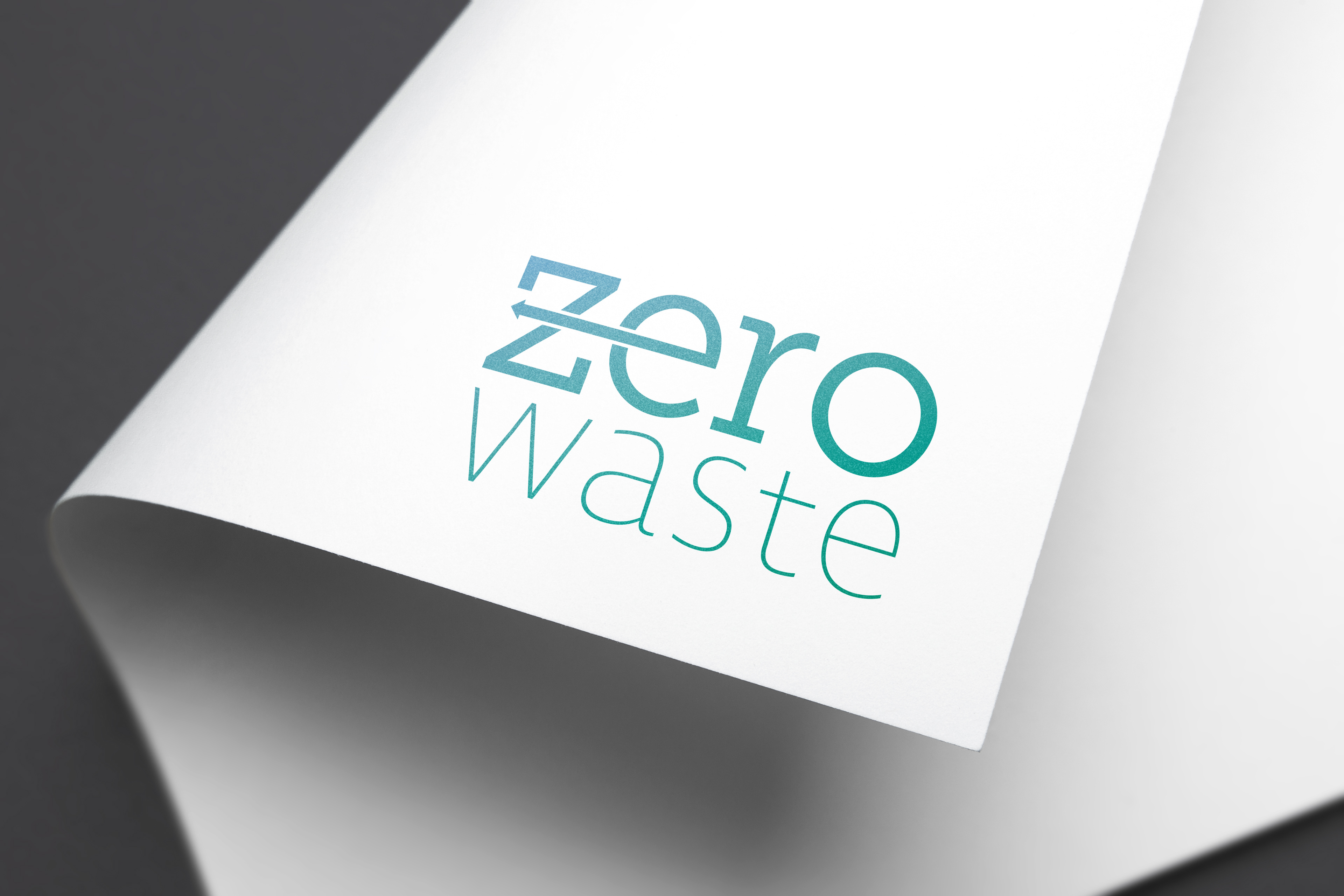
Zero Waste was a program created by a client that i worked with to promote the idea of recycling containers and other used products on a daily basis to reduce trash and build up in our recycling facilities.
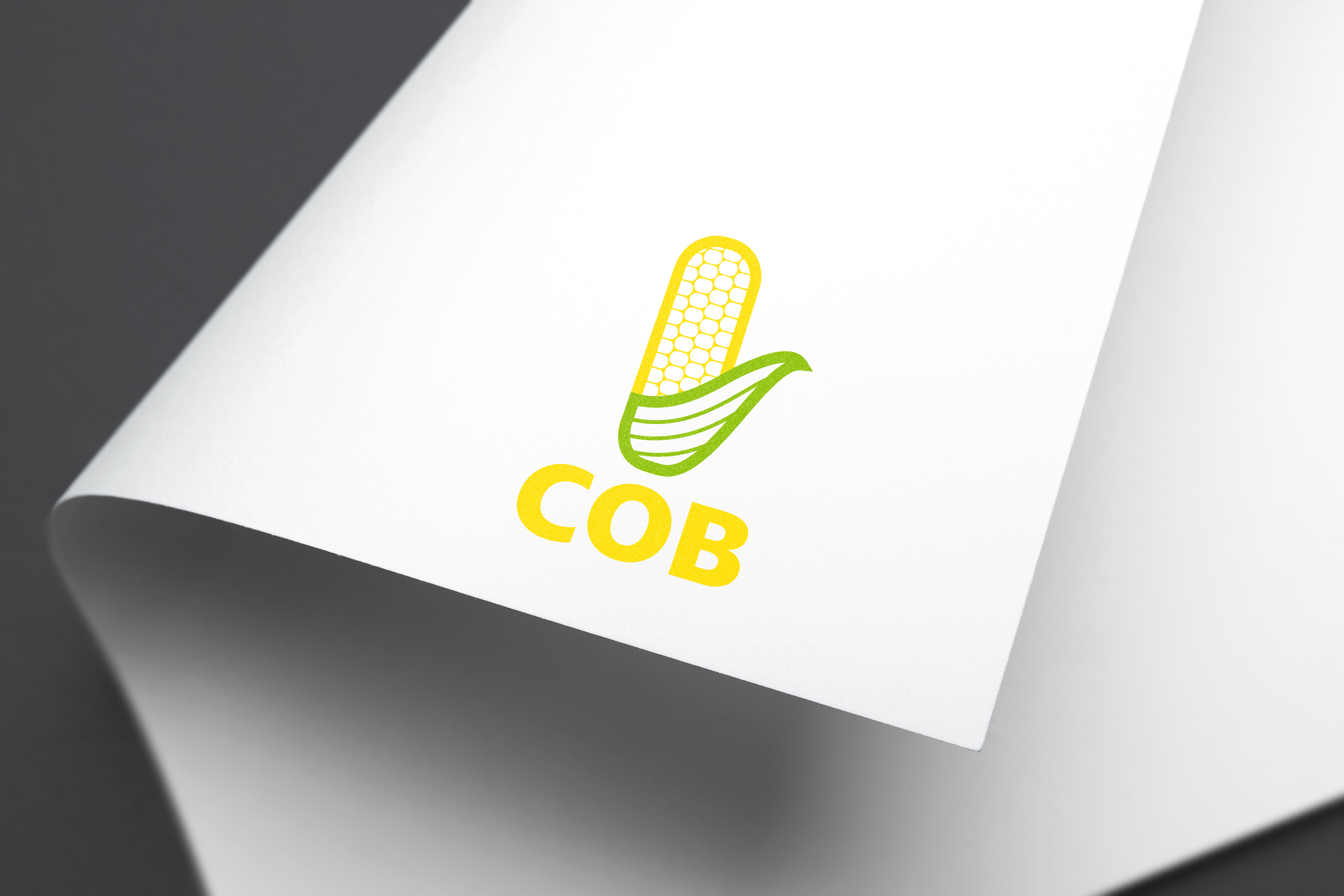
Cob is a product made by a past client that is a corn based powder that is a chemical/liquid absorbent. I wanted to make something simple that pushed the idea that this product was made from corn.
Greenology was a program created by a client to brand a new division of their business. They were an R&D division focused on finding ways to go green with the daily processes and products they sold/used.
This is a logo I made for a client's business (no longer active). They wanted a lawn mower and a compass in the design some where, was there only real request. I shose to take the underside of the lawn mower and combine it with a compass in a very graphical manner.
This logo was created for a client who wanted to rebrand a division of their business. They were focused in the creation/repairing circuit boards mostly for high level and government projects. I researched blueprints of circuit board layouts and used various symbols to create this abstract logo mark.
This was a logo created for a fictional business where they were providing space for professionals to come in and work. They were targeting freelance professionals or worker who worked from home who needed a place to work.
This was a concept I created to replace the Cleveland Indians logo. I have been a long time Cleveland sports fan and I went back in the history of the Indians and thought it would be cool to rebrand them as the first name they were conceived under the Cleveland Blues. Being that Cleveland sports fans are ones who take the time to live in and learn the history of their teams I thought it was only fitting.
Peachtree was a restaurant based in Hudson, OH who thorugh unfortunate events had to shut their doors for good. But before that I redesigned and presented this logo redesign to them and had the circumstances been better would have been considered. They were a bourbon bar and country cooking style restaurant so I wanted to really push that idea in this logo type design.
Rubber City Comics is a comic book shop based in the heart of downtown Akron, OH. I wanted to redesign their logo for a school project and later present them the logo for their consideration for use.
Back to Top