The Design
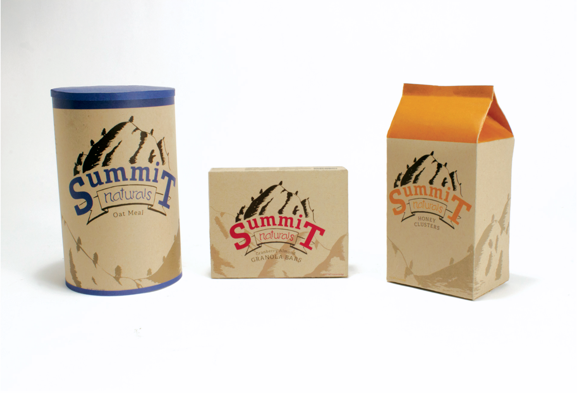
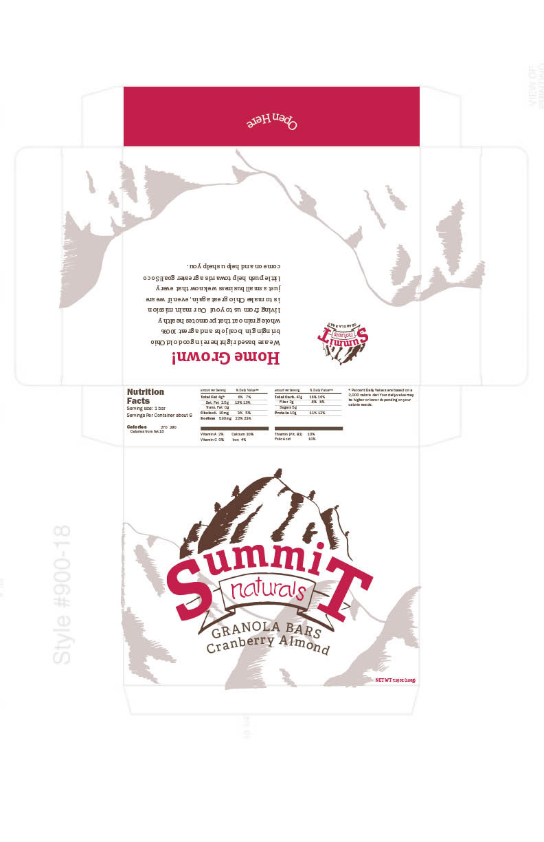
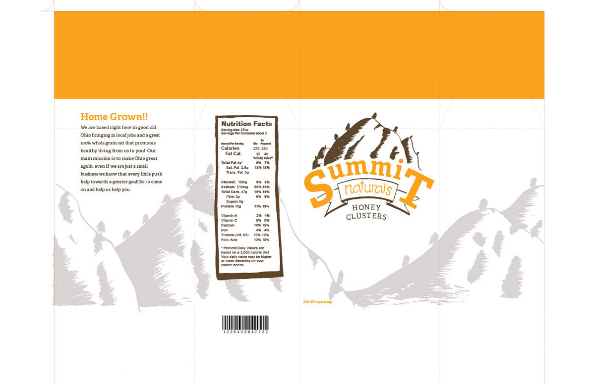
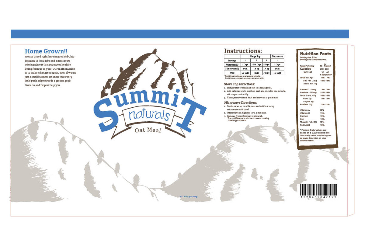
I really wanted this project to have a natural and raw feel to it. I hand-designed the background for the logo, naturals typeface, and the background to the packaging itself. I wanted to show 3 different products from the brand which are flattened oats, granola bars, and honey oat clusters.
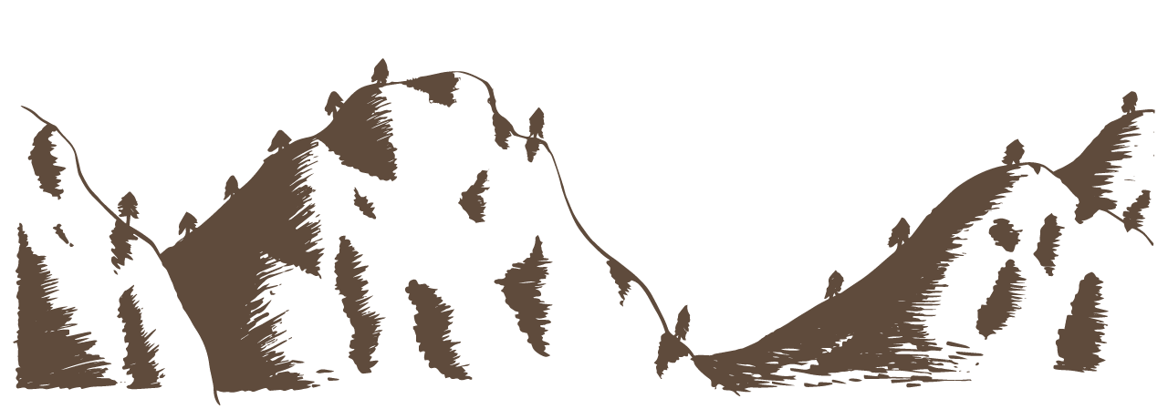
The Illustration
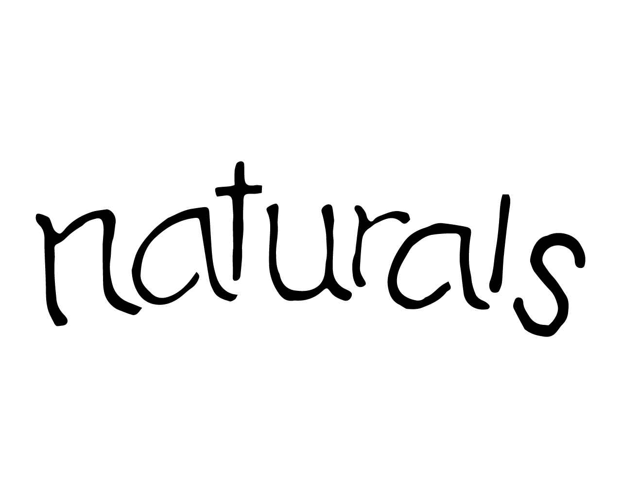
The illustration and the type were illustrated in pencil and ink on paper. Then I took them to Photoshop to clean them up and vectorize them. I chose to keep them purposefully raw looking to add to the more natural feeling of the brand. The illustration meets perfectly so that it can wrap around various sizes of packaging.
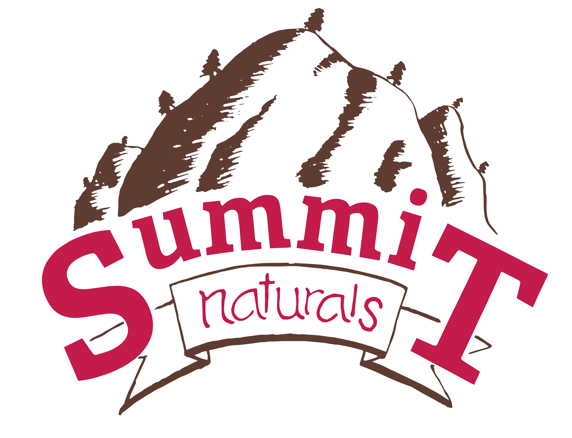
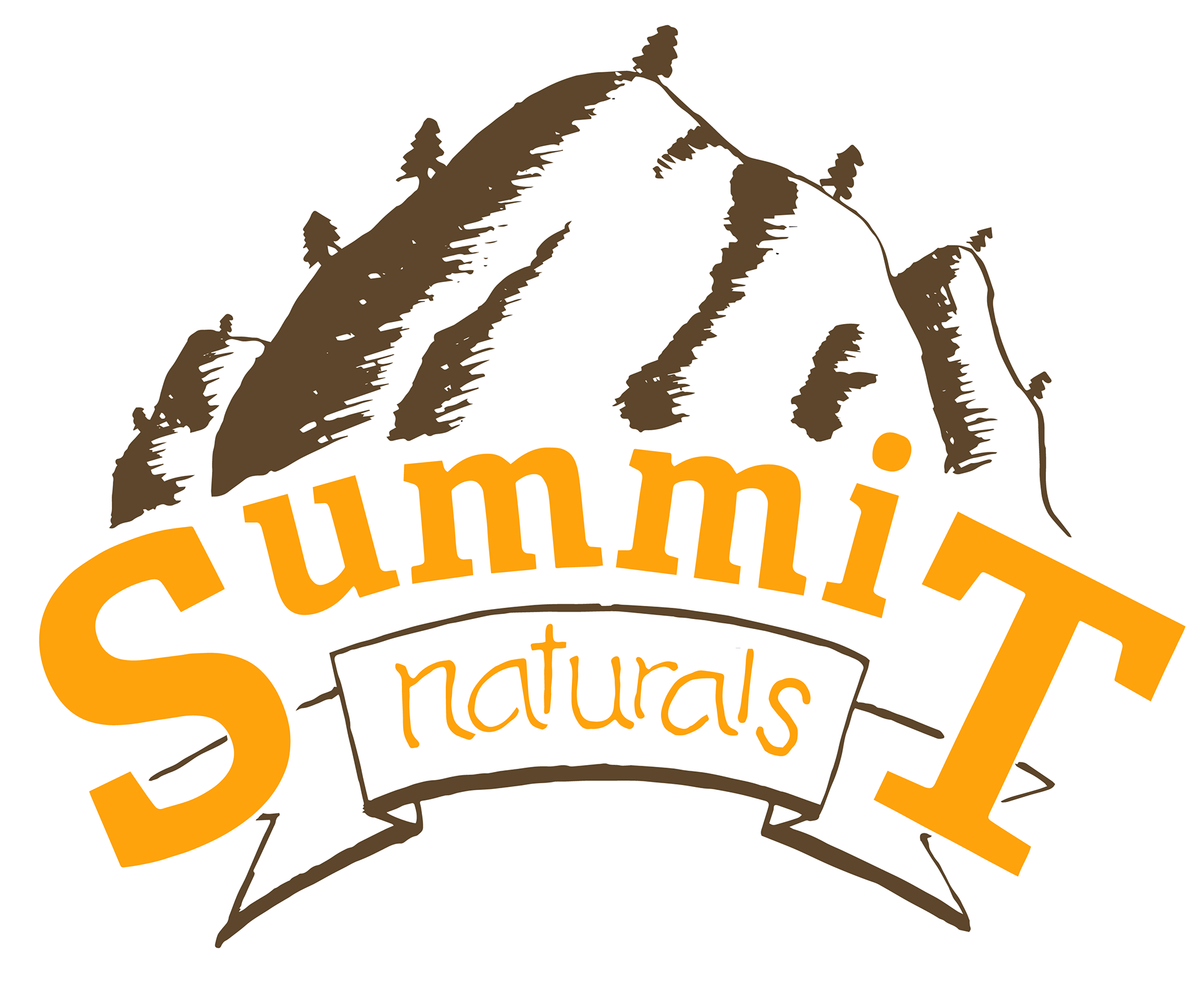
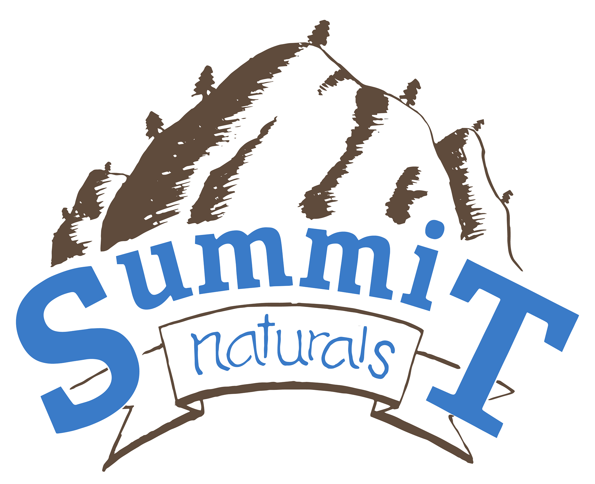
The Logo
Marrying the illustration and the logo together was necessary for the brand. I wanted the design to have a natural and light feeling with the arching text and the open view of the summit of the foothill. I thought it was imperative to have the summit of a foothill to be in the logo. This is to tie in the illustration and to give meaning to being at the summit of great health, as well as being based in Summit County.
The Build
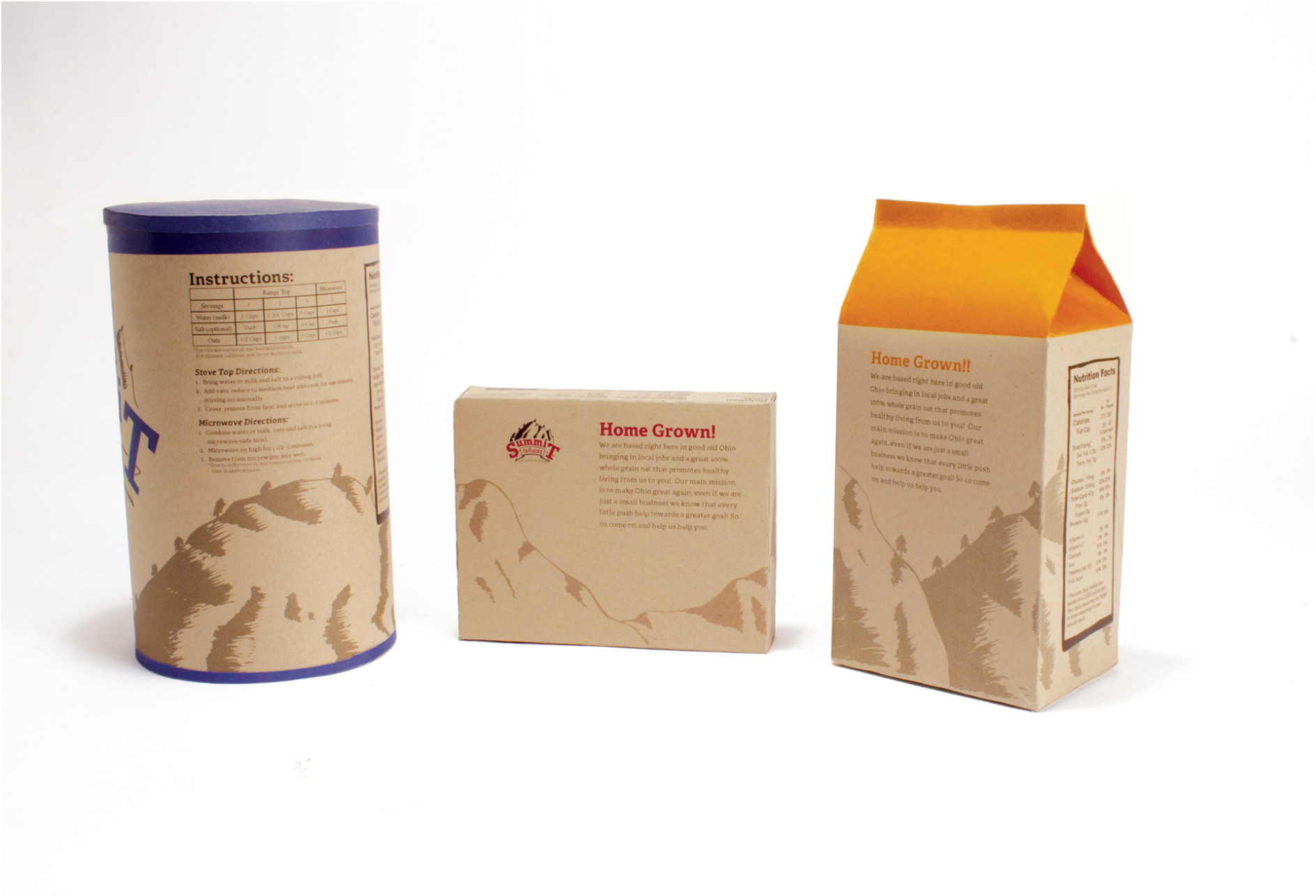
Below are the DI lines that I created to build each of the products. The illustration wraps as intended around the packaging as intended. To push the idea of it being a background texture I chose to drop the opacity of the illustration to give focus to the logo and info on the box while still being visible enough to add to the overall design. Each color was chosen for a specific reason on each box. Blue for the true color of the brand advertising the oatmeal, Cranberry red to advertise the cranberry granola bars, and honey yellow to advertise the honey nut clusters. Each product in the catalog of Summit Naturals would have a respective color to help visually distinguish it from the next product while still falling back on the simple and natural brand look to keep it all cohesive.
Final Design
Bringing all these elements together in 3 simple packages creates a cohesive and simple brand that can not be mistaken for any other in the market.