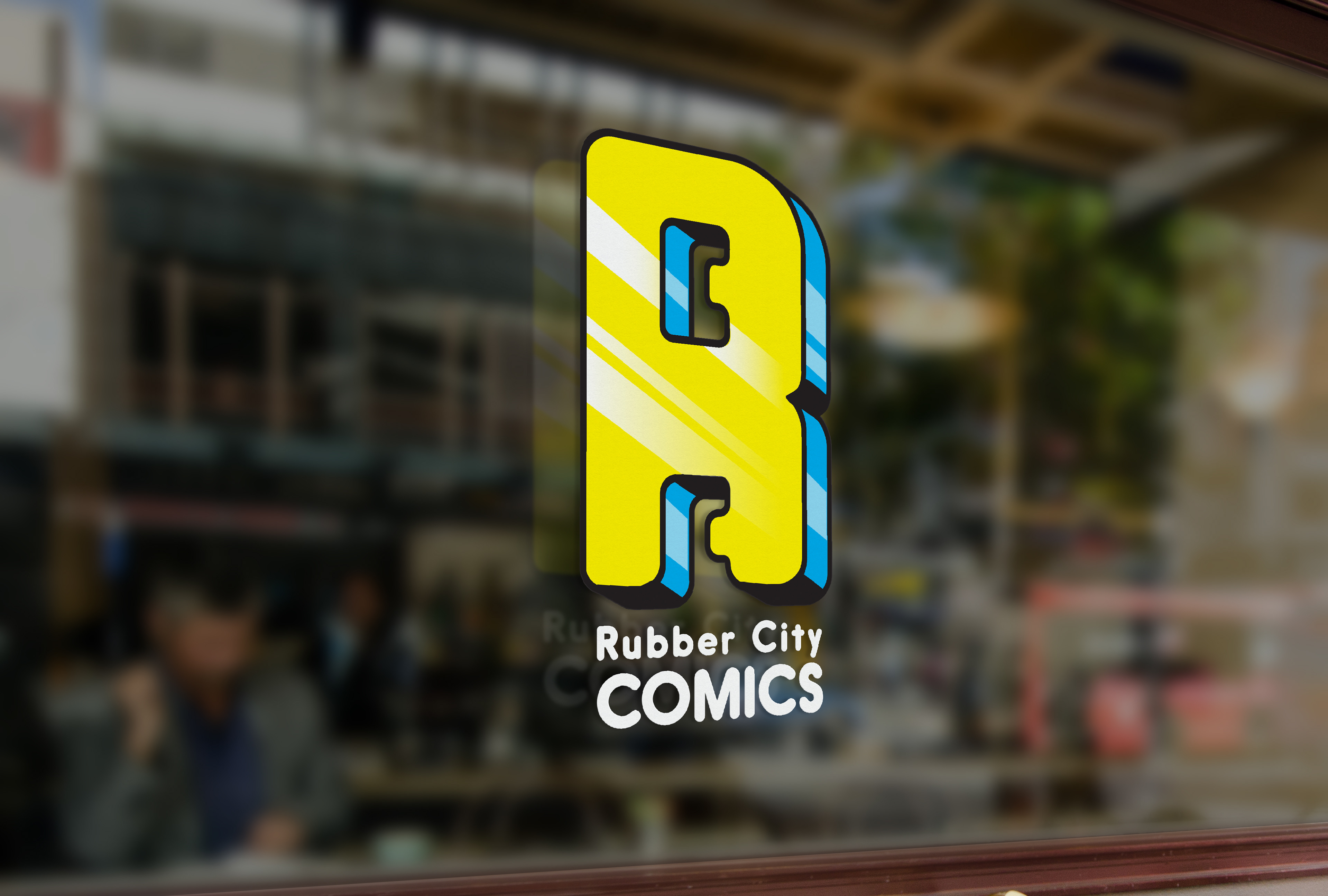
The Logo
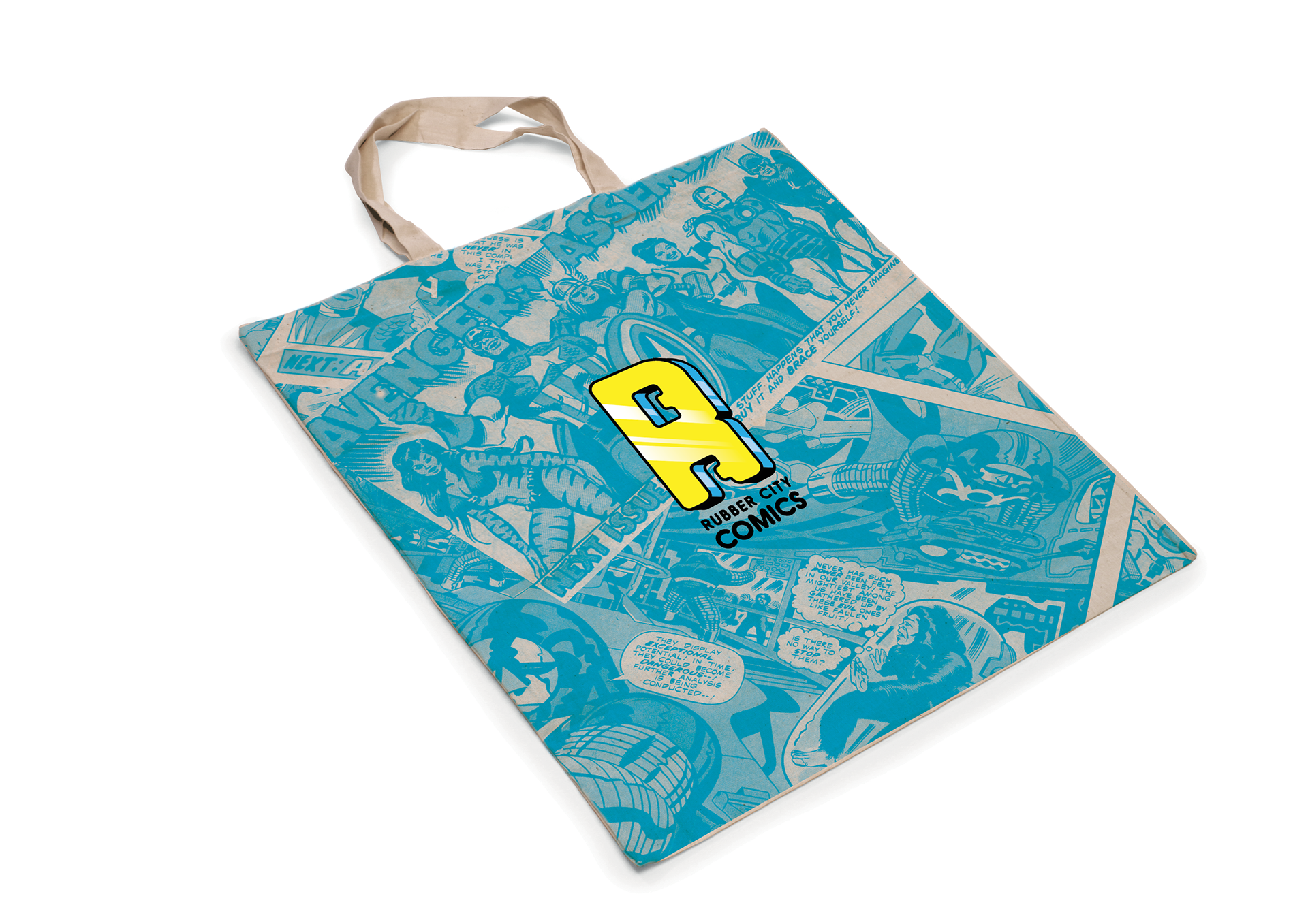
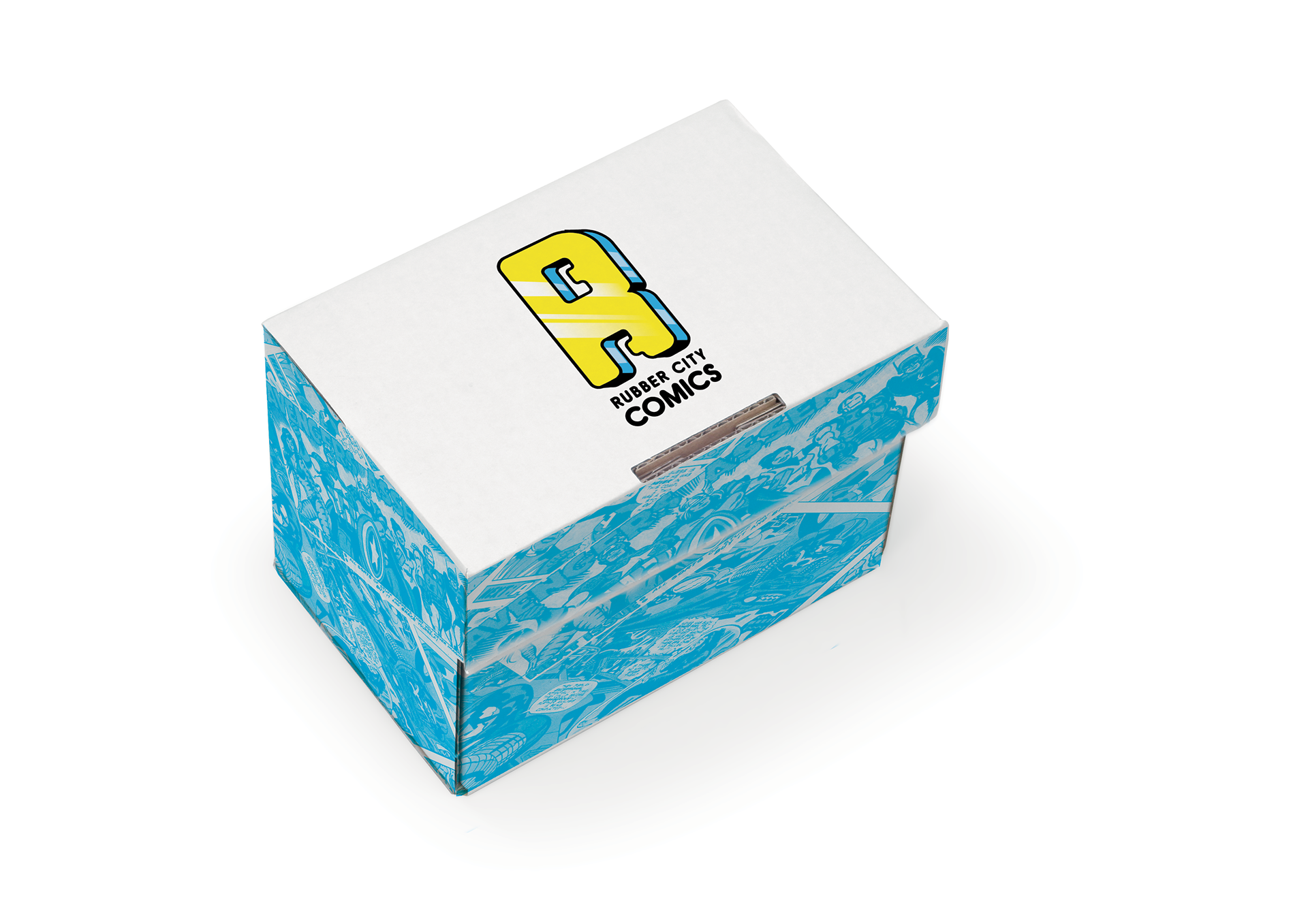
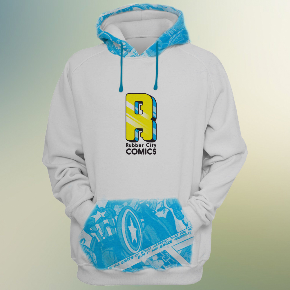
After much experimentation, I came to the idea of creating a monogram logo mark for the Rubber City Comics Brand. I hand drew the letter R cutting out the letter c for the counters of the letter form, unifying the whole name into one simple monogram. The colors I chose were based on the CMYK printing scheme staying true to the method comics are printed in.
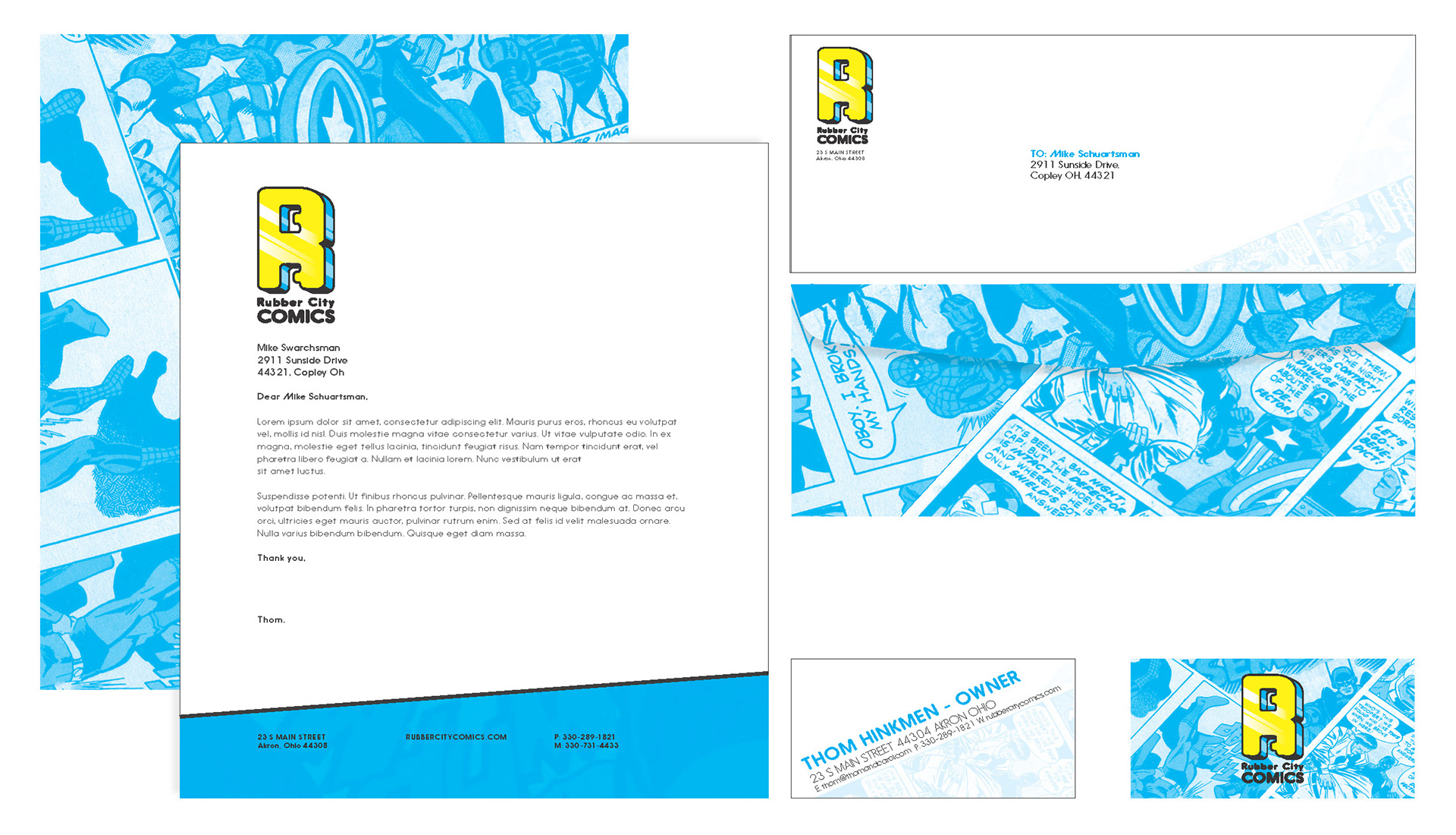
The Stationery
When Creating the Stationary it was necessary to bring the fun comic book elements together with the simple business side of owning a business; the comic collage was the best way to do this. I took high-resolution scans of books that I own and expanded the images to where they were almost unrecognizable and collaged them together creating a great texture as a backdrop for the stationery.
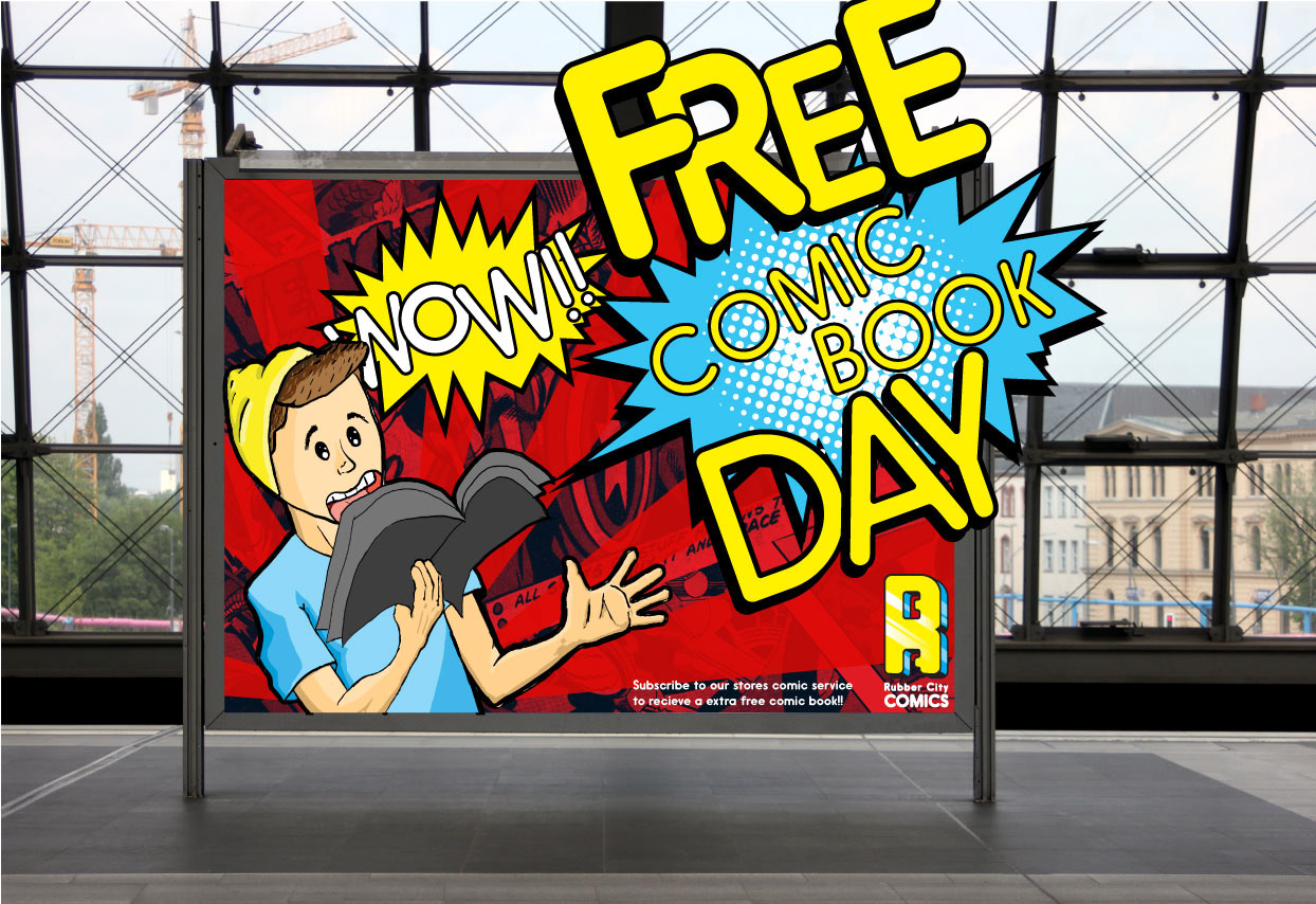
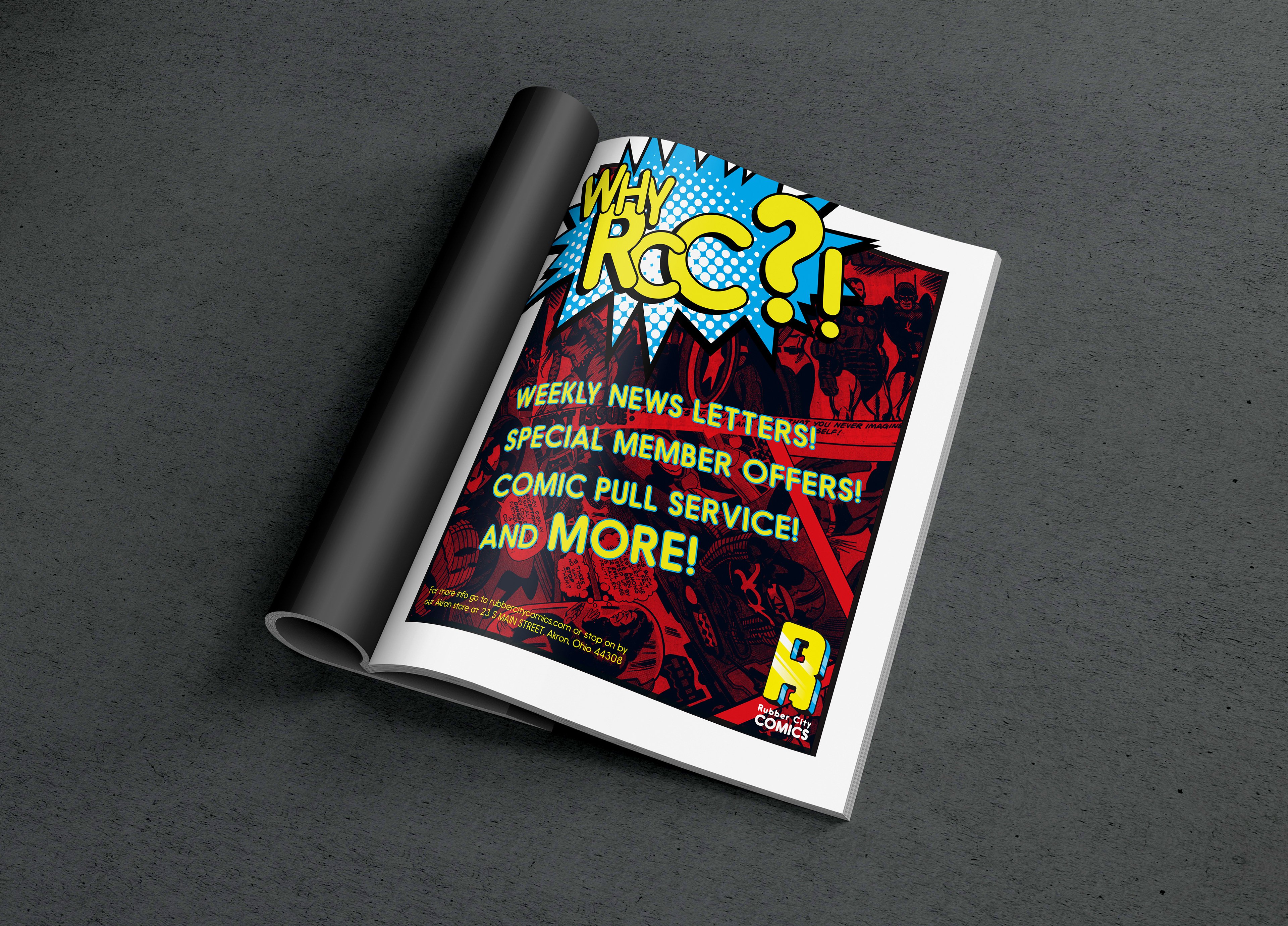
The Ads
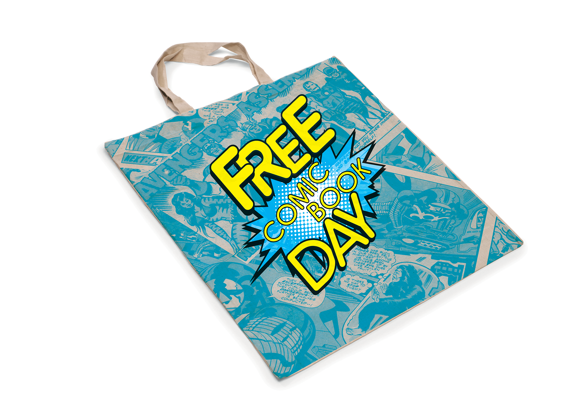
For the ads, I had a bit more fun with them. Promoting free comic book day on the billboard ad space exploding out of the ad frame was one of my favorite creations for the ads giving an exploding feeling just like when reading an action sequence in a book. The magazine definitely leaned more information-based yet still eye-catching with the collage backdrop in the tertiary color of the brand.
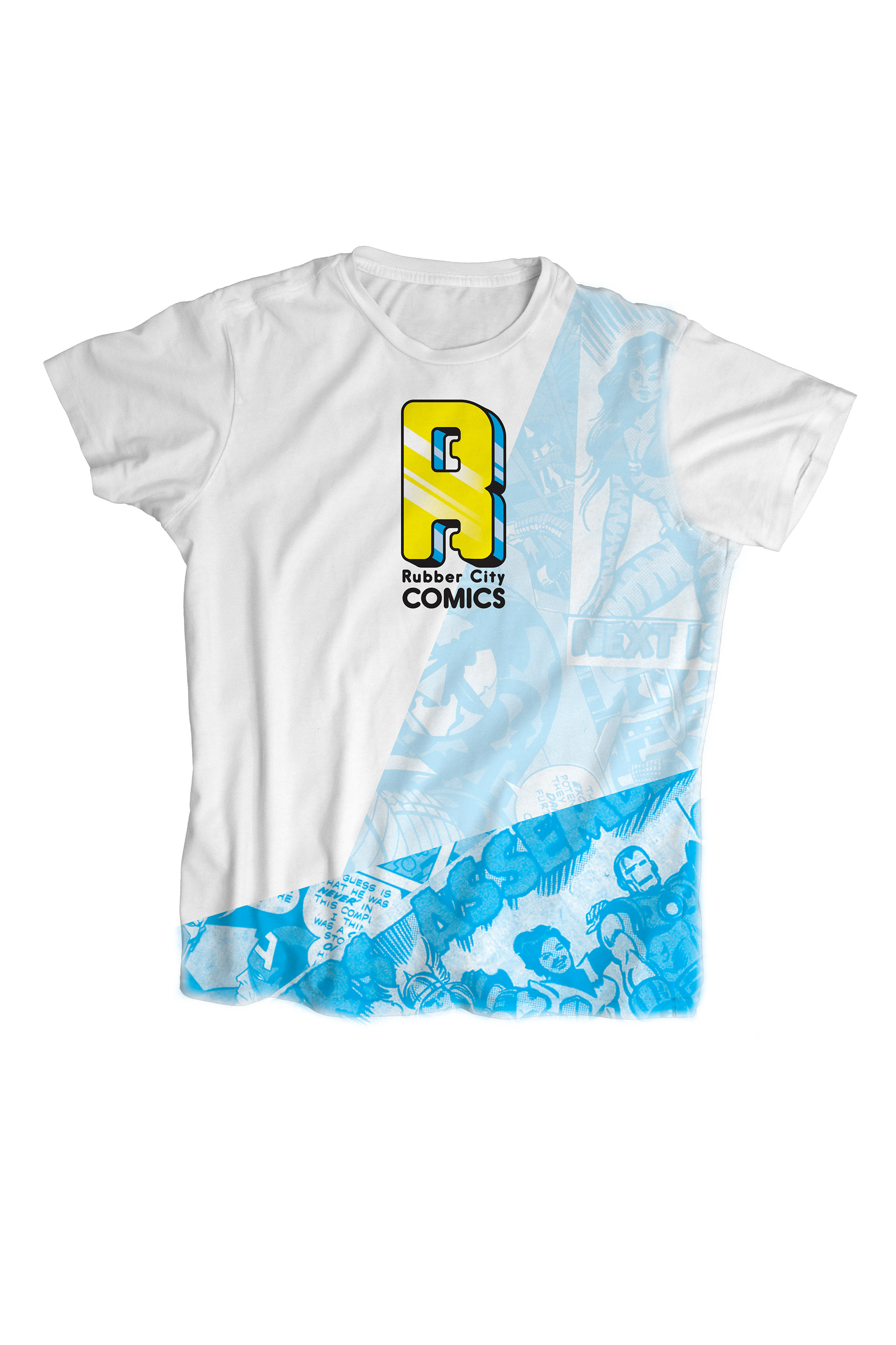
The Merch
For the merch, I wanted to take everything I had created and make some really cool and fun stuff that people would like to own while supporting their local comic store.